


CORE ELEMENTS
Get to know the RIOO brand essentials
Every pixel, every hue, every word—all chosen with intent. Step into our world and discover the elements that make us unmistakably us
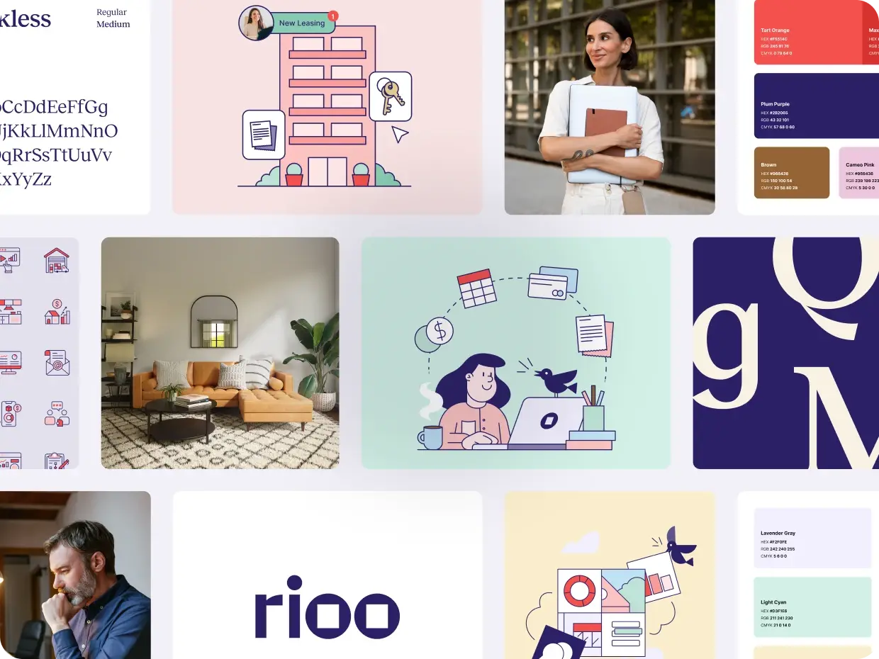
The RIOO logotype is an essential representation of our brand’s identity. When using our logo, follow these basic guidelines and you’ll stay true to our brand:
- Ensure it remains clear and legible, with sufficient space around it to breathe.
- Use the logotype on backgrounds that provide contrast, ensuring it remains prominent and unmistakable.
- Refrain from altering, stretching, or distorting the logotype in any manner.
- Always use the official, provided version to maintain color and shape consistency. By following these basic guidelines, we can ensure that the RIOO brand is represented accurately and consistently across all platforms and touchpoints.
Get to know RIOO’s palette—colors that further define our essence. Stick to these basic pointers to maintain consistency, harmony, and flexibility, while staying true to our brand:
- Always ensure our brand colors are represented accurately across all mediums. This maintains brand integrity and recognizability.
- We’ve carefully selected colors that radiate calm and are pleasing to the eye. Use them in harmony and moderation to avoid overpowering visuals.
- Make sure there’s ample contrast when placing text or elements on colored backgrounds. This ensures readability and clear communication.
- Our colors are versatile. Feel free to use them in gradients, overlays, and patterns, but always ensure the end result aligns with our brand’s aesthetic.
- Just as with our logotype, our colors need some room to breathe. Incorporating white space in designs helps in emphasizing the importance of our brand colors.


Crafting the voice of RIOO means merging our deep-seated expertise with the spirit of innovation, always keeping our audience front and center. Here’s how we want to sound when we communicate our brand’s essence:
Confident & Informed
Every word should exude a modern maturity. We’re well-versed in our industry, so let our expertise shine through in a measured, thoughtful manner.
Innovative Challenger
We aren’t just part of the property management market; we’re here to elevate it. Express our innovative approach and cutting-edge solutions with conviction.
Engaging & Direct
Avoid jargon. Speak in clear terms but maintain a certain sophistication that aligns with our brand’s caliber.
Future-Focused
Always lean into our forward-thinking ethos. Showcase our proactive vision and commitment to next-generation property management.
Relatable & Human-centric
Despite our technological edge, we’re all about people. Maintain a warm undertone that emphasizes our dedication to users and their experiences.
Our typography has been chosen to reflect RIOO’s modern and forward-thinking brand identity. Stick to the specified fonts to ensure brand consistency.
RecklessNeue For Impact
Every word should exude a modern maturity. We’re well-versed in our industry, so let our expertise shine through in a measured, thoughtful manner.

Inter for Readability
We aren’t just part of the property management market; we’re here to elevate it. Express our innovative approach and cutting-edge solutions with conviction.
.webp?width=1536&height=1071&name=brand-typeface1@2x-1536x1071%20(1).webp)
Sizing, spacing, contrast for consistency
- While creativity is encouraged, maintain consistent font sizes and hierarchies across similar materials. This ensures a unified look and feel.
- Proper kerning and leading are essential. Ensure there’s appropriate space between letters and lines for optimal readability.
- When using typography on colored backgrounds or images, ensure there’s enough contrast. This ensures the text stands out and is easily legible.